

Still Life Drawing
A step by step Prismacolor drawing

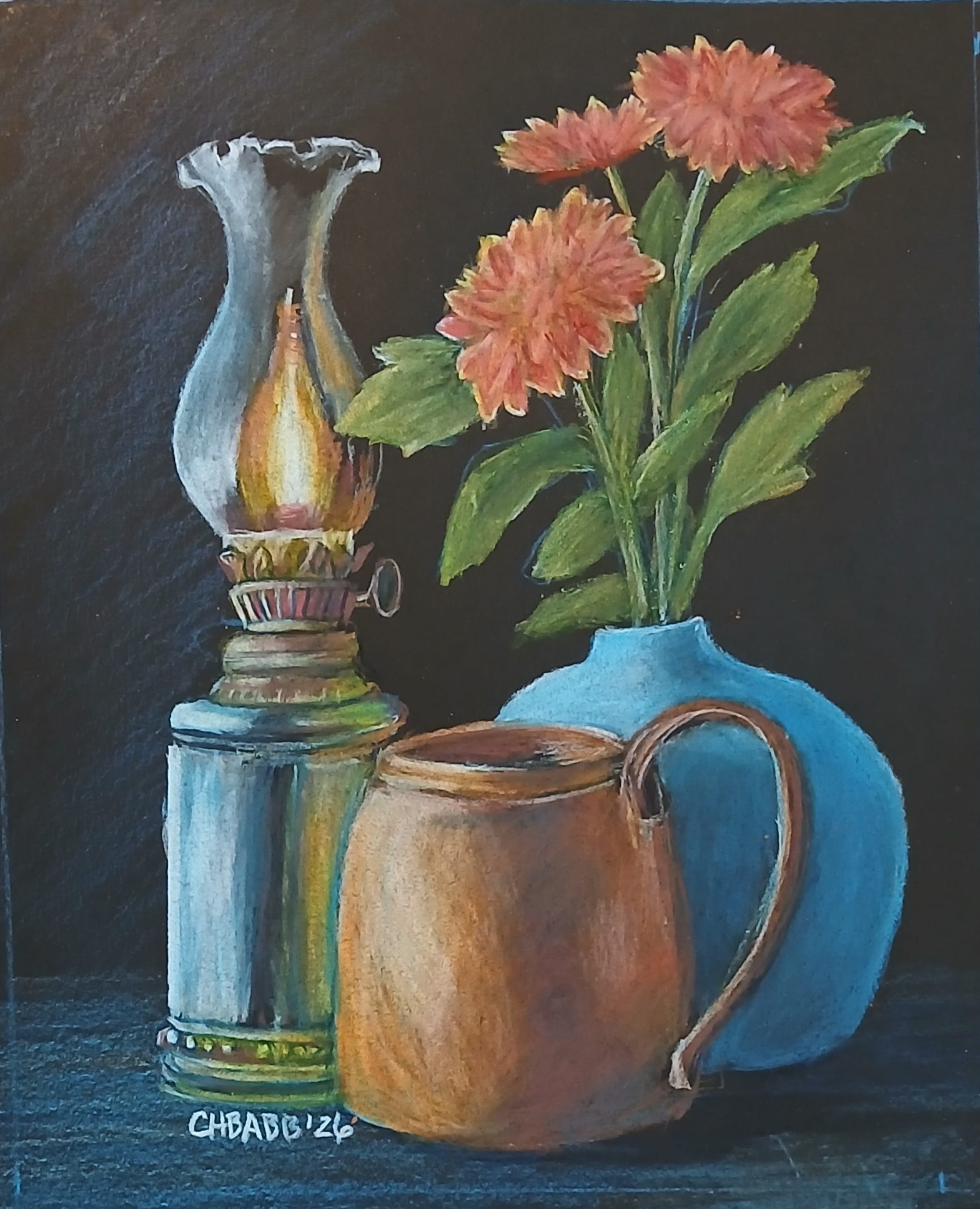
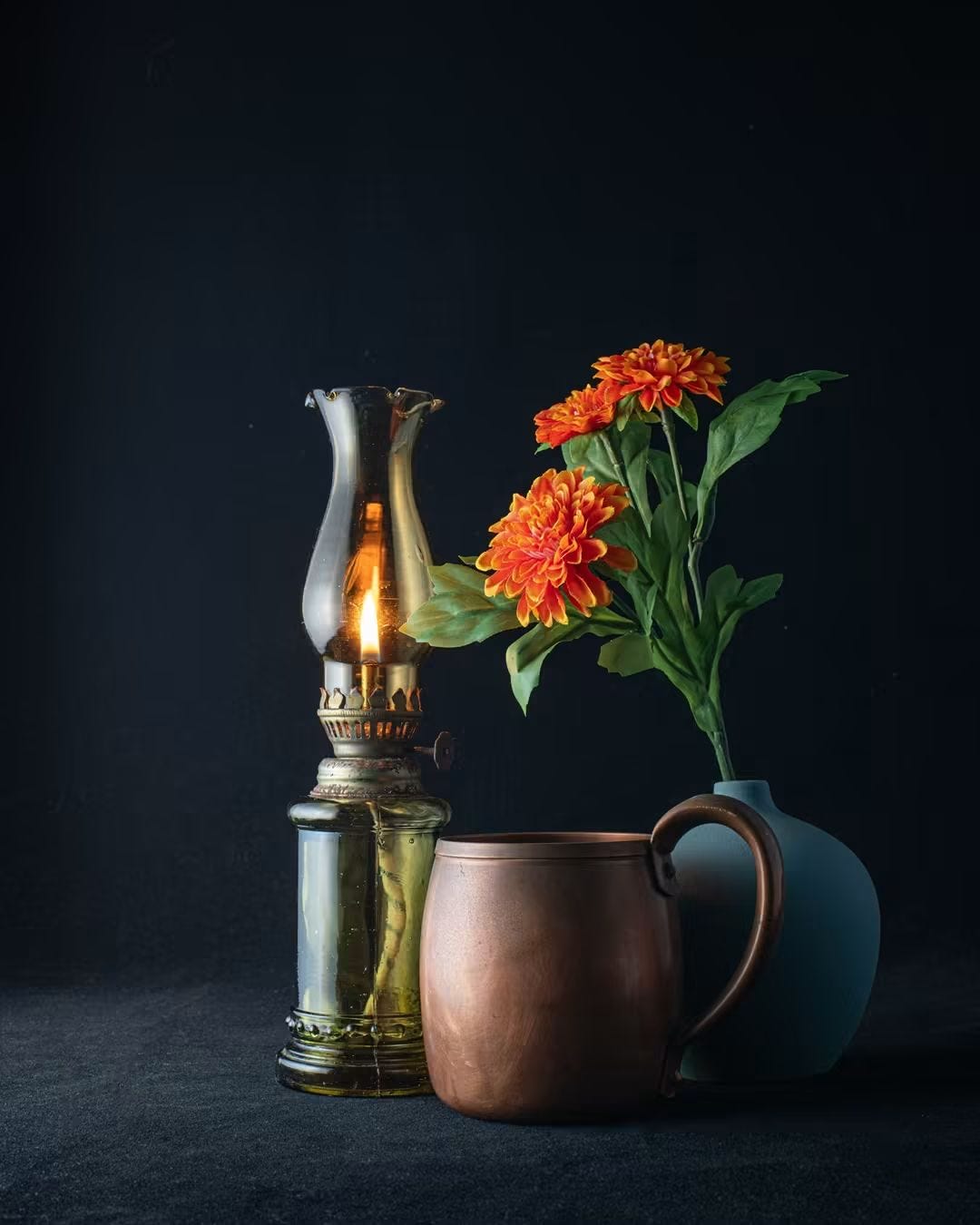
Facebook has a group called Free Reference Photos for Artists, where I saw this photo by David N. Yountas. I liked the contrast of matte and shiny surfaces on the dark background. I hoped to make the copper mug shinier, but that didn’t work out. Still I am happy with it. I left off the string handle for the oil lamp.
I marked out 8x10 on my black pastel paper, since the image was more complicated than what I usually draw. At the suggestion of my drawing buddy, I sketched out the composition with cerulean blue, rather than the gray I usually used. I used a pale yellow for the glass and the flowers. then I layered in the first base colors. I decided to work back to front, filling in the matte turquoise vase first.


Next I worked on the oil lamp, using white, yellow ochre, an a light gray. I layered in shades of cerulean and powder blue for highlights, but decided to use indigo for the darks, which makes the colors harmonious, a split complementary (blue, green, orange) scheme.


I worked on the flowers next, but here is where probably should have done the dark orange first, and layered in the lighter colors. The edges of the flowers were bright yellow, but I could not get the orange as bright as I wanted. The flowers were not really what interested me, but I wanted them to look nice. I added more leaves, as the ones in the picture were silk and not very realistic.


The copper mug was the focal point that interested me the most, and it has a layers of various colors, including the cerulean and indigo as shadows covered over by the oranges and browns. I spent roughly two hours on this drawing, and except for the flowers, I am happy with it.
I think it looks great! Your art keeps getting better and better! ✨